


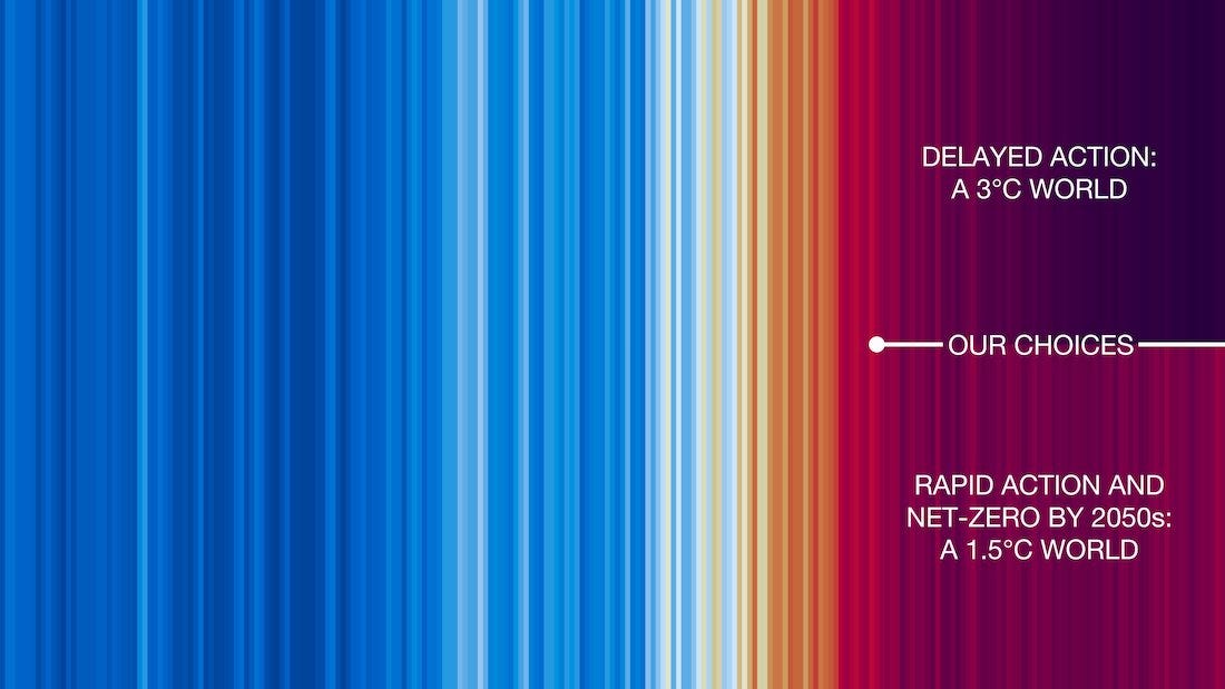
Today is #ShowYourStripesDay, aiming to sustain the push initiated years ago by UK climate scientist Ed Hawkins to use cool and warm colors to depict long-term climate change in ways that might grab attention and ultimately change choices and behavior.
I’ve explored this innovation and related ones for a long time, most notably in a Sustain What webcast on Show Your Stripes Day in 2021. I’ve reposted that episode in Substack’s player above.
As you will learn (or already know if you watched it way back when), there’s still scant behavioral science showing that this data visualization “movement” has mattered. But I see it as part of a vital wider effort to use visualizations or other forms of creative output (music, below) to bring deeper meaning to data.
I’ve done quite a few shows on this theme including these:
How Imagery Can Spur Clean-Energy Progress

Through most of my journalism career, I presumed that more information leads to better choices. As media moved online, I experimented ever more with conveying what I was reporting or learning using far more than the written word.
Visualizing Energy for Social and Climate Impact
Can Innovative Imagery Overcome Big-Number Numbness Stalling Action on Pandemic and Climate Threats?

SUBSCRIBE to receive these dispatches via email (content always free so those who need it most can get it). Track my companion live video webcasts at the Columbia Climate School Sustain What page.
Here’s some of the musical experimentation, in this case from
, who’s been a frequent source of mine for carbon science and policy questions and is also into musical experimentation using climate data: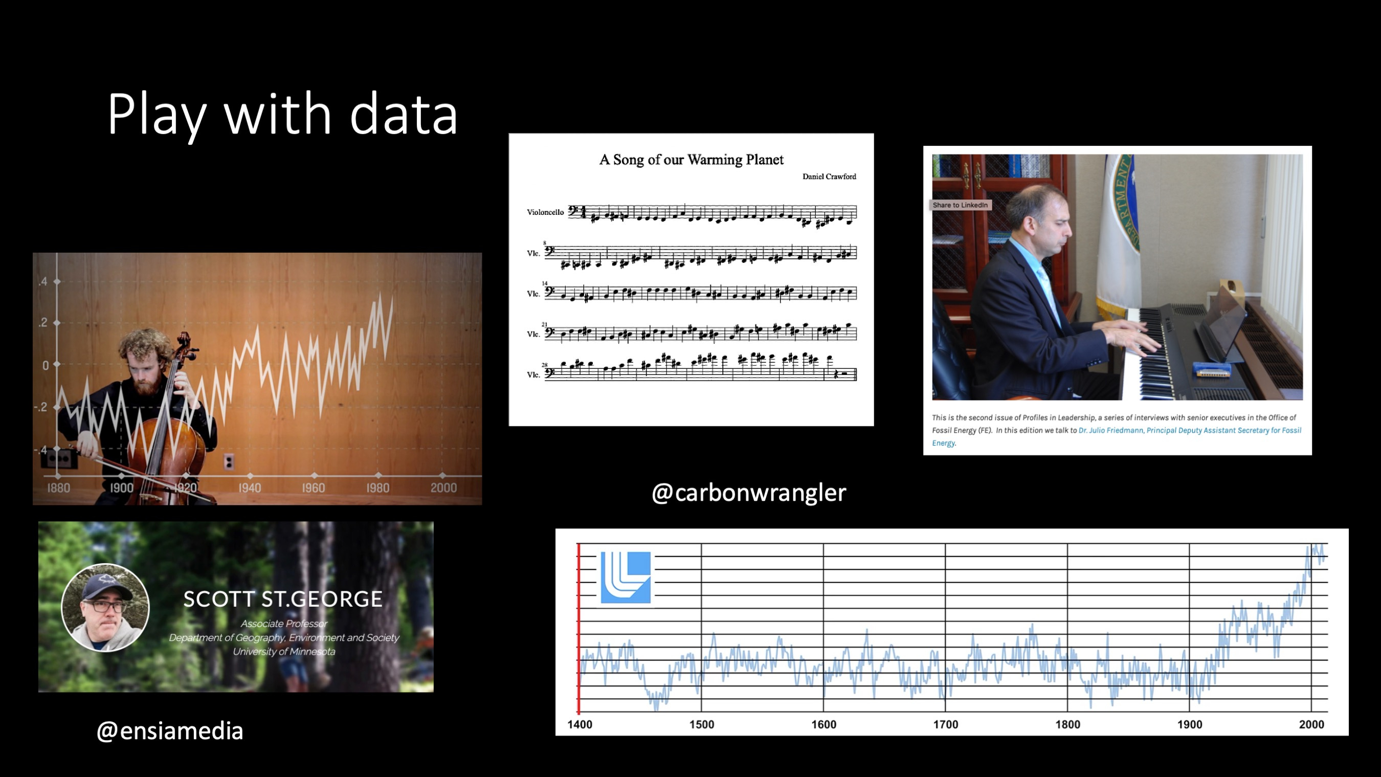


Share this post