Can Innovative Imagery Overcome Big-Number Numbness Stalling Action on Pandemic and Climate Threats?
Facing the normalization of the COVID-19 catastrophe and mounting impacts from climate change, visual communicators are testing new ways to defeat the "scale monster."
SUBSCRIBE to receive these dispatches via email (content always free so those who need it most can get it). Track my companion live video webcasts at the Columbia Climate School Sustain What page.
Various updates - I often allude to the "uncertainty monster" and "scale monster" that stalk sustainability efforts.
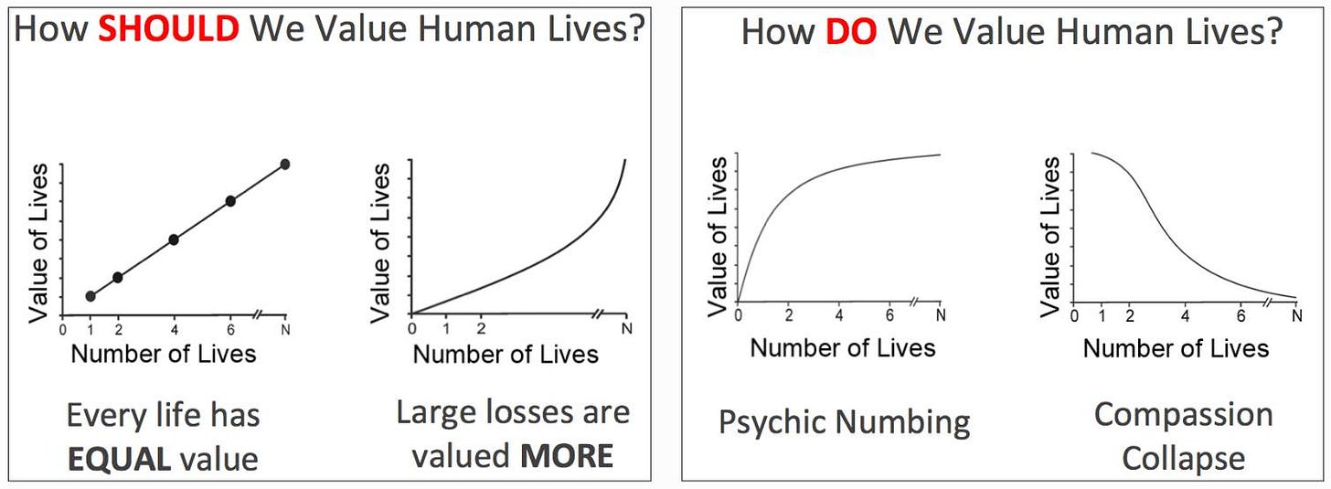
Here we'll glean lessons and brainstorm next steps with some communicators aiming to engage audiences with big numbers that, all too often, lead to "psychic numbing," as Paul Slovic and other social scientists have shown.

As COVID-19 deaths mount into the millions, as global temperatures sustain their steady human-driven rise, a diverse array of journalists, artists, researchers and practitioners are exploring fresh ways to use visual information to convey the scope of the damage so far or jog power brokers, politicians and the public out of shock-to-trance patterns that, all too often, worsen risks ahead.
There's plenty of spillover into the auditory realm. More than a year ago, I hosted a "Dear Vaccine" poetry slam on Sustain What organized with the Global Vaccine Poem Project of the Wick Poetry Center at Kent State University and the University of Arizona Poetry Center. The poet Danusha Laméris said something that serves as a wonderful call to action for anyone trying to harvest insights in dark times in pursuit of brighter futures, including, in this case, learning from the pathogen!
I've been thinking so much about pathogens as the daughter of an immunologist... I've been thinking about what is virulent?... We're in a time where we're experiencing pathogen as this virus we're grappling with, but also ideas. The ideas that we hold can be virulent. It's a year when I see us confronting that as a society.... What's contagious? How can we be contagious in ways that are edifying? How can we infect the world with different kinds of thinking? - Danusha Laméris
My latest Sustain What webcast, Communicating Catastrophe at Scale, centered on two very different experiments in propelling progress through data visualization:
a scrolling Axios journey through the death count to the one million mark as the pandemic timeline unreels (and it is still unreeling)
the stunning "In America" installation of hundreds of thousands of small white flags on the National Mall, each memorializing one of the fallen, undertaken by the visual artist Suzanne Brennan Firstenberg
That physical installation, which has had a couple of iterations, integrated massive scale and piercing personal detail. The online version carries that mix to people who can never visit Washington, as you can see in this example generated when I clicked on one flag on the digital map.
In October, aerial photographer Curt Westergard shot a stunning top-down view of the memorial when there were 660,000 flags. Firstenberg's team just posted an update showing what the white fields would look like with the current tally of 1 million.
Firstenberg joined me in conversation with Jacque Schrag and Jared Whalen, two of the four Axios journalists who worked on the million-deaths package; my Bulletin colleague James Hamblin, who is a journalist, physician and lecturer at the Yale School of Public Health; and the health-policy strategist Federico Vazquez Calero. Based in Mexico City, Calero consults with the World Health Organization and Pan American Health Organization on public-health risk communication methods.
These shows really are better watched than read, so please do watch here or on Facebook, LinkedIn or Twitter. And please share the links on those platforms with others so we can spread this conversation.
If you can't watch, just stream it and listen. Or you can sift a very rough transcript here for details if you wish. (Rough is an understatement; I'm planning to hire an assistant soon!)
Here are some takeaways and extra resources.
Beyond clicks
A key focus in the discussion was what can be done beyond conveying the scope of loss, honoring those whose lives were cut short and creating pressure for accountability. What is the role of communication innovation in actually limiting losses on the path ahead?
As I wrote in my piece on how you can "own" Twitter no matter what Elon Musk does, I noted the life-saving capacity of the platform in Indonesian flood zones.
At one point, I posed this question to Whalen: "If you could do imagine a graphic that focuses on preparedness, what does that look like?"
Here's his take, offering a glimpse of their visual package:
Know your audience(s)
We talked about climate communication a bit.
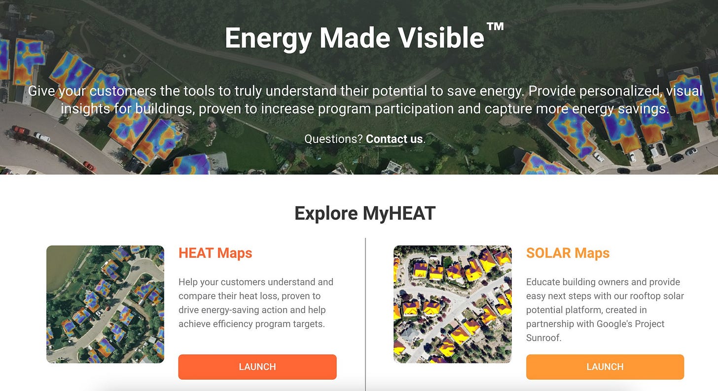
I cited Myheat.ca, what I see is one of the most exciting experiments using visualizations of community adoption of solar panels and of house-by-house heat loss to build momentum around commonsense energy actions. I'll be doing a conversation with that team and some outside experts soon!
Can warming stripes slow warming?
I alluded to the "Show Your Stripes" visualizations of global heating data by Ed Hawkins of the University of Reading. Here's his latest:
But when I ran a Sustain What conversation with Hawkins and others, including Ulrike Hahn, who is researching climate art impacts, and some wonderful knitters crafting warming-stripes tapestries, it became clear there's little data yet showing an impact beyond those already clued in.
Here’s a snapshot of our discussion of the Tempestry Project climate knitting project.
And the messages to the world can be mixed depending on the orientations of observers. I mentioned an experience recounted by a Columbia Climate School colleague, the oceanographer Andrew Goodwillie. He's co-leading the Climate Smart task force in his Hudson Valley village. He thought it would be appealing to have the "warming stripes" pattern - cool blue stripes of the 19th century climate trending to hot reds now - as a backdrop on the banner of the project website.
But it turned out many in the community saw red-blue politics in the stripes instead of climate history!
Know your audience, or at least learn and adjust. (The stripes are gone now.)
Jacque Schrag said the graphics team at Axios long ago realized the importance of sweating details like choosing colors. “We have style guides in place to try and address some of these things,” she said. Because of the political interpretation of red and blue, she said, “We try and avoid using red and blue on charts when possible…because it's so ingrained in our audience.”
[Update 6/21/2024: The paragraph above is corrected; see the initial language at the bottom of the post.]
"Facts don't move souls"
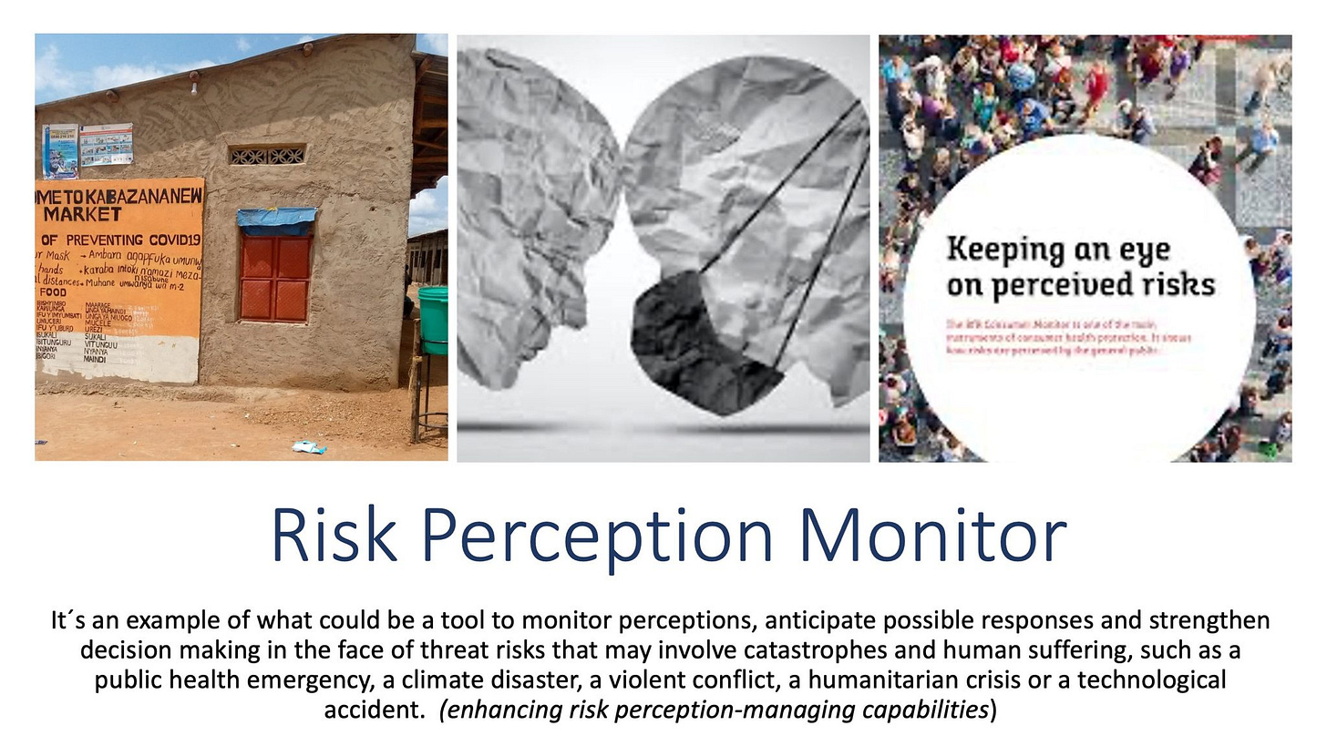
Federico Calero cited a host of examples from around the world showing how communication, to be effective, has to be tuned to cultural and political realities. The failure to do this contributed to the spread of the pandemic, he said, adding he's trying to find collaborators to work on "a risk-perception monitor" that can help agencies stay abreast of the sentiments in at-risk communities before they forge communication plans. Here's a slide and an excerpt from his remarks:
"We have to integrate culture in risk communication.... One of the main reasons is that facts don't match perceptions. We can have all the facts, all the numbers. But facts don't move souls. I think that is one of the main reasons we had the pandemic. We need to to use cultural to communicate in very creative ways. I think we also need about who decides, who builds the narrative."
The "Arithmetic of Compassion"
We only scratched the surface in this webcast and the same goes for this post. All of my Sustain What conversations and posts are iterative, leading to exciting new connections or questions.
To go deeper on moving from the inertia of risk at scale to efficacy, there's no better starting point than the Arithmetic of Compassion website, centered on decades of scholarship by the psychologist Paul Slovic of the University of Oregon, his son Scott Slovic, a professor of literature and the environment at the University of Idaho, and a remarkable network of collaborators.
The mission of the team is central to the challenge facing us all in this century: "to raise awareness of psychological obstacles to compassion, including psychic numbing, pseudoinefficacy, and the prominence effect. These cognitive biases lead to inaction in the face of some of the world’s largest humanitarian challenges, including genocide, famine, and climate change."
Here's a presentation the Slovics gave recently for the University of Cambridge's Center for the Study of Existential Risk:
Much of what is on the site builds from a book by the Slovics that will be the focus of a future Sustain What conversation (they were both unavailable this week): Numbers and Nerves Information, Emotion, and Meaning in a World of Data.
Catastrophe conversations at scale
In the early days of the emerging pandemic, Scott Gabriel Knowles, a "slow disaster" historian now teaching in South Korea, launched what he called Covid Calls, a nearly-daily set of conversations that - en masse - provide a trove of insights that can serve historians going forward. And, yes, he's still at it hundreds of conversations later.
Covid Calls
Actions
The World Photography Organization, with Sony Pictures Television and the United Nations Foundation, is sponsoring a global Picture This competition seeking 30-60 second videos that raise awareness and inspire action around climate. There's no fee and the deadline is 5 July. Get to it!
Correction
The marked paragraph above has been corrected. My original language had inaccurately summarized what Schrag said this way: “Their internal guidelines, she said, banish the colors red and blue unless a graphic is expressly about those political camps.” I apologize that it took so long to fix this.
Parting shot
Here's a very brief video clip using candles to illustrate a key insight from Paul Slovic's work on scale and atrocity:


I have much to read and study yet but my gut says this is the human animal. What is it that gets everybodies attention, globally? A global disaster.. This is going to happen sooner than later I've been reading of concern about La Nina, this time. In this case a disaster can be an opportunity. Is there a case for preparation for such a moment?