Through most of my journalism career, I presumed that more information leads to better choices. As media moved online, I experimented ever more with conveying what I was reporting or learning using far more than the written word.
When I went to the North Pole in 2003, I brought back video that captured the unnerving dynamics and sounds of floating, drifting sea ice far better than words could. At climate negotiations in 2005 in Montreal, I tried out podcasting, recording the passionate voices of youth activists as a way to get beyond the gray-suited wonkiness of these sessions. I cobbled graphics on my Dot Earth blog and highlighted other brilliant work there and on my Sustain What webcast, like the carbon visualizations of Adam Nieman.
But what works?
From 2006 on I spent ever more time talking to behavioral scientists about paths from communicating environmental risk to susatainable societal change - and the answers were uniformly disquieting, ranging from “we don’t know” downward to sobering realities like “cultural cognition” (our hunan habit of seeing the same data through divergent cultural filters).
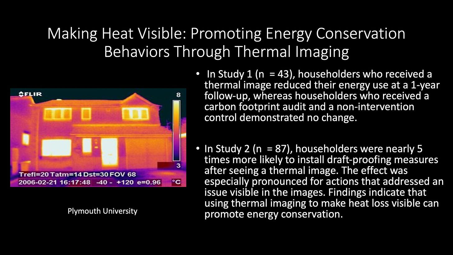
Here’s one such conversation, with Sabine Pahl of the University of Vienna. Pahl has focused for many years on whether and how visual information changes behavior related to environmental challenges and choices. Her work shows that visuals can matter. The results of one early study that caught my attention are here, showing that when infrared images revealing heat leaking from homes are included in flyers on weatherization, homeowners are more apt to invest in improvements.
The study is "Making Heat Visible: Promoting Energy Conservation Behaviors Through Thermal Imaging." Here's a related report: "Exploring the Use of Thermal Imagery for the Promotion of Residential Energy Efficiency.”
I recorded this conversation a couple of years ago, but never aired it. Pahl’s insights and ideas remain as fresh as ever.
Please share this post with others. I’ve set it up to stream on the Sustain What webcast as well, so you can share it with friends or colleagues on Facebook or LinkedIn.
I also encourage you to click back to watch a Sustain What episode from one year ago on a Boston University project visualizing energy trends and dynamics for climate and sustainability impact. I spoke with Cutler Cleveland, project founder and director, and Heather Clifford, the chief data scientist. That show included James Henry, a representative from MyHEAT.ca, a Canadian firm using visual information to drive energy savings and solar adoption.
Warming stripes
Also watch and share my 2021 webcast on the “warming stripes” of British climlate scientist Ed Hawkins: “Exploring Climate Visualization Frontiers on #ShareYourStripes Day”
The stripes have gotten heaps of attention (I’ve discussed some of this before), but Ph.D. candidate Ulrike Hahn, who participated in the webcast, wrote a paper showing how little is known about whether such artwork matters.
It’s important not to be swept away by the coolness factor with communication innovation. But it’s also vital to keep pushing communication frontiers.
Here’s a parting shot from our my journey as a lecturer on a Lindblad/National Geographic cruise to Vanuatu and the Solomon Islands (see my recent post):


Share this post